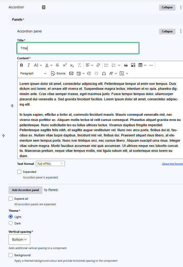
Lorem ipsum dolor sit amet, consectetur adipiscing elit. Pellentesque tempor ut enim non tempus. Duis dictum orci lorem, et ornare elit viverra et. Suspendisse magna lectus, interdum et ex quis, pharetra dignissim ante. Cras vitae semper massa, eget maximus justo. Fusce tempor tempus dolor, ullamcorper placerat dui venenatis a. Sed gravida tincidunt facilisis. Lorem ipsum dolor sit amet, consectetur adipiscing elit.
In turpis sapien, efficitur a tortor at, commodo tincidunt mauris. Mauris consequat venenatis nisl, nec viverra risus porttitor ac. Aliquam mollis lectus id velit cursus consequat. Phasellus aliquet gravida eros eu pellentesque. Nunc sollicitudin leo eu tellus ultrices luctus. Vivamus dapibus fringilla imperdiet. Pellentesque sagittis felis nibh, et sagittis augue vestibulum vel. Nunc nec arcu porta, finibus dui id, faucibus ex. Nullam vitae turpis dapibus, tincidunt nisl vel, finibus dui. Praesent aliquet risus libero, at elementum sem tempus porta. Nunc non tristique orci, nec cursus libero. Aliquam suscipit urna risus. Integer vitae rutrum magna. Morbi faucibus accumsan nisi quis accumsan. Ut ultrices neque nec lobortis convallis. Maecenas pretium, neque vitae tempus mollis, nisi ligula rutrum elit, ut scelerisque eros lorem eu diam.