

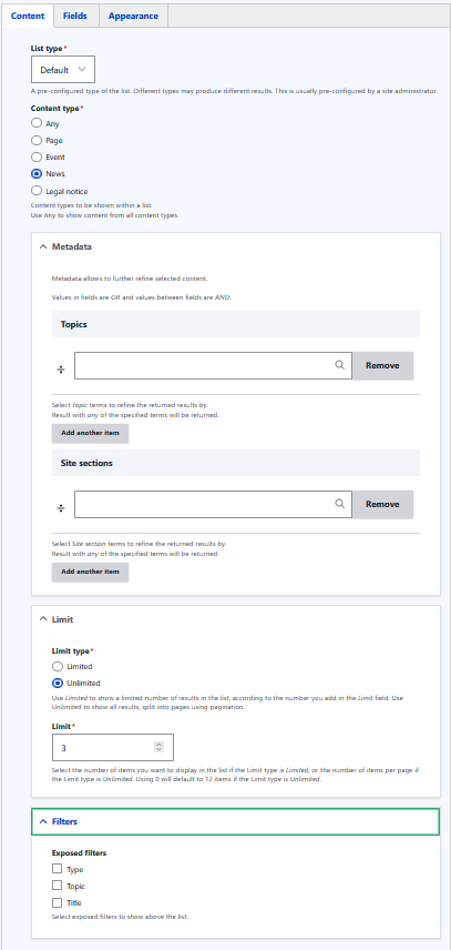
The Automated List component dynamically displays a list of content cards from the site, which can be filtered and restricted to show only what is needed. You can select the content type to display (Page, Event, News, or Legal Notice), filter by metadata such as topic or site section, set a limit on how many cards are shown, and optionally expose filters to allow users to refine the list themselves.
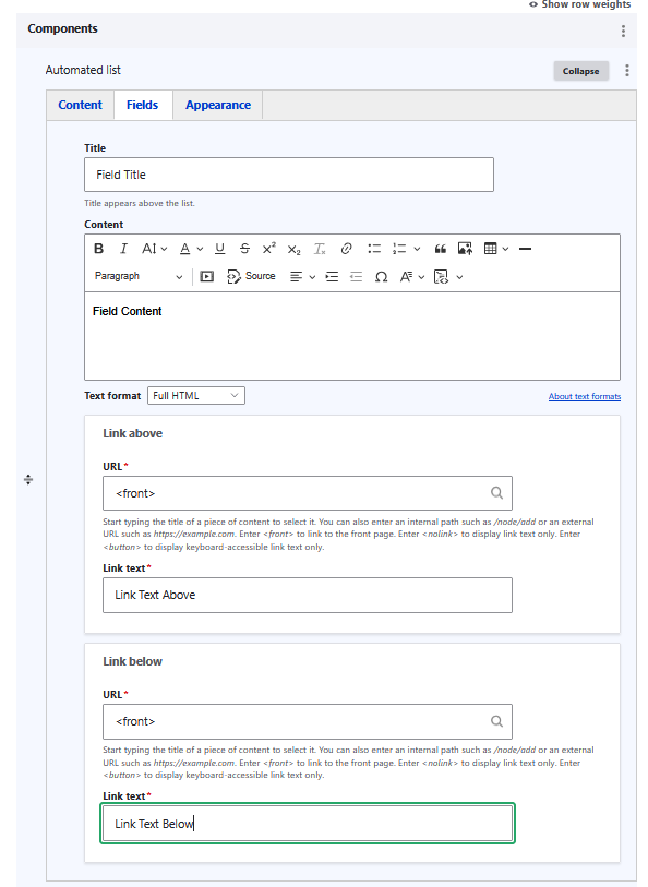
The Fields tab allows you to add a title and introductory content above the list, as well as two optional call-to-action links, one displayed above the list and one below, each with a configurable URL and link text.
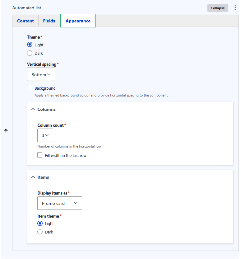
The Appearance tab controls how the list is displayed visually. You can set the theme, vertical spacing, and optional background for the overall component. Under Columns, you can define how many columns the cards are arranged in and whether the last row fills the full width. Under Items, you can choose how each card is displayed (such as Promo card).
Example:
Content Field